




A practical guide to the Apple App Store and Google Play review issues developers run into most often-and how to fix each one before you submit.
Shipping a working app is only half the job. The other half is getting it past review, and app store rejection reasons rarely come down to broken code. More often it's a missing settings screen, an unlabeled screenshot, or a test account that stopped working three days into the review window. Apple and Google both publish detailed guidelines, but knowing which parts reviewers actually enforce-and where teams typically get caught out-only comes from going through the process yourself.
This guide covers the 11 app rejection reasons we see most often across live submissions, along with the fixes that resolved them. It draws on hands-on experience from PIT Solutions' Mobile Application Development Services team, who have taken apps through Apple App Store rejection and Google Play rejection cycles across native, and hybrid builds and learned- sometimes the hard way-what actually gets a submission approved.
Use the sections below as a working reference for your app submission guidelines, and check the consolidated checklist near the end before you hit submit.
Missing or Improper Privacy Policy
A missing or badly implemented privacy policy is still one of the easiest ways to get bounced from review, even though it's entirely avoidable. Both stores require a policy-and simply having one written somewhere on your website isn't enough.
Apple and Google both require a valid privacy policy URL submitted at the time of listing (in App Store Connect and the Play Console respectively), and that policy has to stay publicly reachable at all times-never behind a login or a paywall, even for apps that don't explicitly collect data.
The mistake that catches most teams: external redirects
Dropping in a link that opens the policy in Safari or Chrome feels like the obvious solution, but both stores expect the policy to render inside the app itself, on a dedicated scrollable screen. Sending users out to an external browser reads as a broken flow to reviewers and is a frequent, easily fixed rejection trigger.
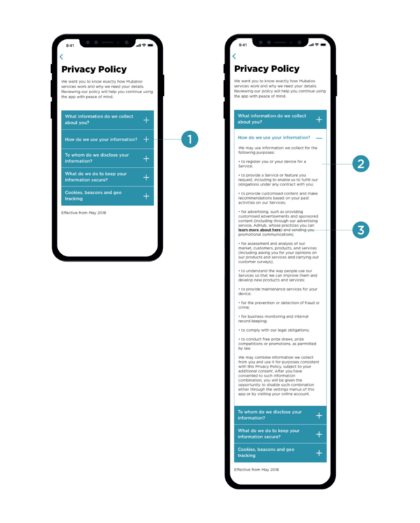
Example of a privacy policy rendered natively in-app, with expandable sections-the pattern both stores expect.
Key actions
-
Build a native Settings > Privacy Policy screen that renders the full text-no openURL() calls.
-
Submit the policy URL in both App Store Connect and the Google Play Console.
-
Keep the policy publicly accessible with no login wall.
-
Review the policy text every time your data practices change, not just before submission.
Incomplete or Inaccurate Data Safety Declarations
Both platforms have tightened data transparency considerably, and "the app doesn't collect anything" is rarely a safe answer anymore. You're on the hook for declaring everything your code and every embedded SDK touches-not just what you wrote yourself.
Apple's Privacy Nutrition Labels
Apple sorts disclosures into three buckets-Data Used to Track You, Data Linked to You, and Data Not Linked to You. If what reviewers find during inspection doesn't match your declared labels, the app gets rejected outright-this is one area where Apple's checks are genuinely strict.
Google's Data Safety section
Google Play requires you to disclose what data types are collected, whether collection is required or optional, whether anything is shared with third parties, the purpose of collection, and whether users can request deletion.
The SDK blind spot
Analytics tools, ad networks, crash reporters, and social logins all collect data on your behalf, and you're responsible for declaring what they collect-not just your own code. Firebase Analytics, AdMob, Meta Audience Network, and Crashlytics are common offenders that teams forget to audit before submission.
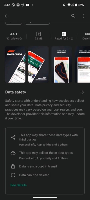
Google Play's Data Safety card, as shown on a live store listing-this is what reviewers check your declarations against.
Key actions
-
Audit every third-party SDK for the data it actually collects-don't rely on the vendor's marketing copy.
-
Match your declared labels exactly to what a reviewer will observe in testing.
-
Add clear, plain-language consent prompts before any sensitive data collection begins.
-
Update your declarations every time an SDK version changes.
Incorrect or Misleading App Information
Your store listing isn't just marketing copy-both Apple and Google actively review it, and a sloppy listing can trigger anything from a rejection to a full removal of a live app.
Wrong platform, wrong screenshots
Uploading Android screenshots to App Store Connect (or the reverse) happens more than you'd think, especially on cross-platform projects. In one submission, an Android screenshot went up on App Store Connect and Apple's reviewers flagged it immediately-the status bar gave it away. That single detail was enough for a rejection.
Placeholder content is not neutral by default
On a project built around user-generated content, the team needed listing screenshots before real content existed, so they used placeholder images to fill out the UI. One of those images happened to show a person with a leaf in the background. Google's automated review flagged it as drug-related and the app wasn't just rejected-it was removed from the store entirely, taking existing users and revenue down with it. A rejection means fix-and-resubmit; a removal means your live app is gone. That gap is worth remembering before you settle for "good enough" placeholder imagery.
Metadata mistakes to avoid
Mistake |
Why it causes rejection |
| Keyword stuffing in the title | Violates both stores' metadata guidelines |
| Mentioning competitor app names | Not permitted by Apple or Google |
| Claiming features the app doesn't have | Misleading-grounds for removal |
| Wrong app category selected | Misleads users and reviewers |
| Promotional language (e.g. "#1 App") | Not allowed without verifiable proof |
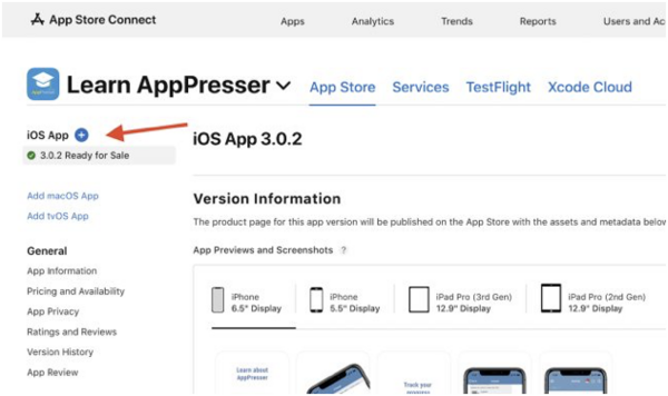
App Store Connect's listing screen-where mismatched screenshots and metadata get caught.
Key actions
-
Capture screenshots on the correct platform's real device or simulator-never mix iOS and Android UI.
-
Have a second person review every screenshot's full content, not just the app UI, before submission.
-
Keep screenshots current with the live build-update them with every major redesign.
-
Write an honest, keyword-relevant description without stuffing or unverifiable claims.
Missing User-Generated Content Moderation Features
Any app that lets people post, comment, message, or upload-a pattern common across Hybrid App Development projects with social or community features-gets classified by both stores as a User-Generated Content (UGC) app. That classification comes with a fixed set of requirements, and simply not having them built is grounds for direct rejection.
Apple's Guideline 1.2 asks for a way to filter objectionable content before or after it goes live, a way to report abusive content or users, the ability to block abusive users, and a real commitment to acting on reports. Google's UGC policy is functionally the same: accessible in-app reporting, a system to act on it, blocking, and stricter controls where the audience skews toward minors.
The four features reviewers look for :
Report content. Every post, comment, or image needs an accessible report option, ideally one or two taps away, with categorized reasons and a confirmation once submitted.
Hide content. Users should be able to remove something from their own feed without formally reporting it-a lighter-weight personal control.
Block user. Blocking needs to be comprehensive: no profile visibility, no messages, no content showing up in the blocker's feed, manageable from settings.
Report user. Separate from reporting content, this covers behavior patterns like repeated harassment or impersonation, with categorized reasons of its own.
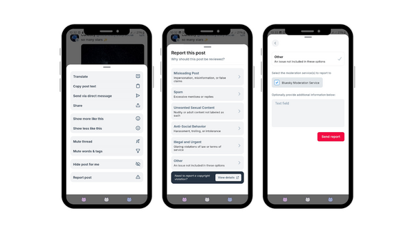
A well-built report flow: quick access from the post menu, categorized reasons, and a clear submission path.
A report button that goes nowhere-no moderation backend, no follow-up-is treated by reviewers the same as not having the feature at all. Build the queue behind it, even if it's a simple internal dashboard.
Key actions
-
Implement all four moderation actions-report content, hide, block, report user-before submission.
-
Stand up a moderation queue, even a lightweight one, so reports actually get actioned.
-
Define a response SLA (e.g., 24–48 hours for severe reports) and be ready to describe it if asked.
-
Log moderation actions in case either store requests an audit.
Missing Account Deletion & Improper Sign-Up Flow
Account management is one of the most strictly policed areas of review, particularly for iOS App Development, where Apple made in-app account deletion a hard requirement back in June 2022. Teams that built their apps before that date are the ones most often caught out today.
Apple's Guideline 5.1.1 is direct about it: if your app supports account creation, it must also support account deletion inside the app-not by email request, not by sending users to a website. Google's policy, updated December 2023, adds that a web-based deletion option should also exist for people who've already uninstalled the app, and that data-only deletion should be offered separately from full account deletion where relevant.
What "deletion" actually has to mean
Deactivating or hiding an account doesn't count. Reviewers expect permanent removal of personal data within a reasonable, clearly communicated timeframe, along with a grace period to cancel the deletion if the user changes their mind-good UX that reviewers also happen to appreciate.
If your app has no sign-up at all
You're not required to build deletion, but you do need to declare that correctly-no account-linked data in Apple's Privacy Nutrition Label, an explicit "account creation not supported" in Google's Data Safety form. Mismatches between actual app behavior and what's declared are a common and entirely self-inflicted rejection trigger.
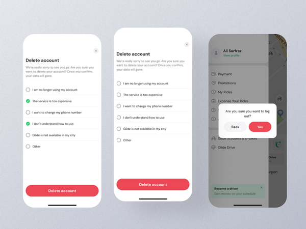
A complete in-app deletion flow-settings, confirmation, and a clear warning before the action is final.
Key actions
-
Build account deletion natively in-app, reachable in 2–3 taps - never via email or an external link.
-
Make deletion permanent, with clear messaging on what's removed and by when.
-
Revoke third-party sign-in tokens (Google, Apple) as part of the deletion flow.
-
If there's no sign-up flow, make sure both stores' privacy declarations reflect that accurately.
Missing or Incomplete Demo Account for Review
Reviewers are real people testing your actual app, not evaluating it on trust. If they can't log in and get to the core functionality, the submission comes back - a working demo account isn't a courtesy, it's part of the required package.
Apple's Guideline 2.3 expects login credentials wherever sign-in is required, step-by-step notes in the App Review Notes field, details on any special hardware or setup, and - where physical hardware is involved - a video demo. Google's equivalent lives in the App Access section of Play Console and expects the same level of detail for anything gated behind authentication or a subscription.
Where this gets genuinely hard: IoT and hardware integrations
If your app pairs with a physical device, the reviewer doesn't have your hardware sitting on their desk. One IoT submission we worked on stalled because the reviewer couldn't get past the device-pairing screen - there was no way to simulate that flow without the actual gadget. Apple's follow-up request was specific: build a way to mock the entire device integration so the review team could evaluate the app without needing the hardware in hand.
Three ways to handle this, in order of preference: build a dedicated demo/mock mode that simulates pairing and sensor data; if that's not feasible, attach a screen-recorded walkthrough of the full flow to your App Review Notes (or an unlisted YouTube link for Play Store); and, as a last resort for high-profile hardware, some teams do ship a physical unit directly to the review team.
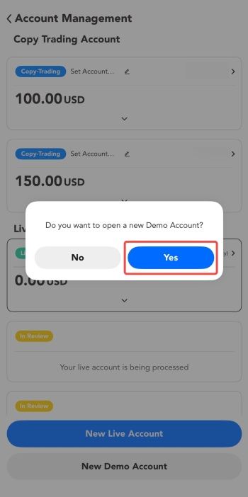
A demo-mode prompt like this gives reviewers a self-contained way to explore the app without live data.
Key actions
-
Provide unlocked demo credentials pre-populated with realistic sample data - empty states make review harder than it needs to be.
-
Write App Review Notes as if for someone who has never seen the app before.
-
For hardware-dependent apps, build a mock mode or attach a complete video walkthrough.
-
Test the credentials yourself immediately before submitting.
Test Account Broken or Inaccessible During Review
This is the most frustrating category of rejection because the app itself is often fine - the review simply hits a login error somewhere in a 1-to-5-day window, and from the reviewer's side, a broken login and a broken app look identical.
We've seen this play out directly: a test account worked perfectly at submission time, but partway through the review window a teammate cleared it out during an unrelated database cleanup, treating it as an unused entry. When Apple's reviewer tried to log in, the account was simply gone. The rejection had nothing to do with code - it cost the team days of resubmission for a mistake that had nothing to do with the actual product.
The fix is mostly process, not engineering: treat the review account as untouchable the moment a build is submitted, tag it clearly in the database (something like STORE_REVIEW_ACCOUNT - DO NOT DELETE), and tell the whole team a review is active so nobody runs a cleanup script against it by accident.
Key actions
-
Create a dedicated reviewer account, separate from every other dev or QA account, and mark it as protected.
-
Notify the team the moment a build enters review - no deployments or database resets until it clears.
-
Check the account login and server uptime at least once daily through the review window.
-
Keep a backup account ready in case the primary one breaks mid-review.
App Not Responsive Across All Device Sizes
Testing exclusively on a flagship device is a habit worth breaking. Both stores expect your app to hold together - no clipped buttons, no overlapping text - across the full range of supported screens, and a broken layout on even one device is a legitimate rejection reason. This is where Mobile App Testing and QA earns its keep: catching these issues before a reviewer does is far cheaper than a resubmission cycle.
Apple expects a genuine native iPad layout, not an iPhone screen scaled up, and reviewers do test across device types - an iPhone SE or iPad Pro breaking your layout will get flagged. Google's requirements are similar for large screens and foldables from Android 12L onward, and the Play Console's Pre-Launch Report will surface a lot of these issues automatically before a human even looks at it.
The two tests teams skip most often
The small-screen test, iPhone SE, budget Android devices - because developers build and test on their own high-end phones and never check anything smaller. And the large-screen test, because tablets are treated as an afterthought even though both platforms are pushing harder on tablet and foldable experiences.
A few technical habits prevent most of these failures: build with relative layouts (Auto Layout or SwiftUI's adaptive system on iOS, ConstraintLayout with dp units on Android) rather than fixed pixel dimensions; make sure input fields scroll above the keyboard; respect safe area insets so nothing sits behind a notch or gesture bar; and test with the largest accessibility font size enabled, since layouts that only work at default text size will break for a meaningful share of real users.
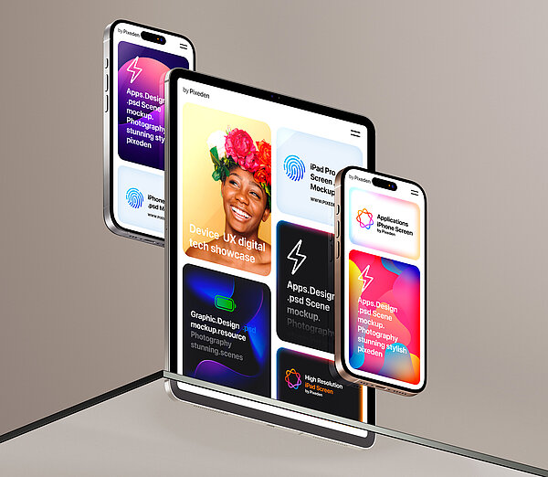
Layouts need to hold up across the full device range - not just the phone in your hand.
Key actions
-
Test on the smallest and largest supported device for each platform, not just your development phone.
-
Build native tablet layouts - an upscaled phone UI reads as unfinished to reviewers.
-
Ensure keyboards never cover input fields and forms remain scrollable.
-
Check the Google Play Pre-Launch Report before every submission.
Non-Compliant Payment Gateway & In-App Purchase Integration
Monetization is probably the most heavily regulated area of review, and getting it wrong doesn't just mean a rejection - it can mean permanent removal or a revenue clawback. The core rule is simple to state and easy to get wrong in practice: digital goods and services go through the platform's own purchase system.
Apple's Guideline 3.1.1 requires all digital goods and services inside an iOS app to go through In-App Purchase, with Apple taking a 15–30% commission and third-party processors like Stripe or PayPal off the table for anything digital. Physical goods and services delivered outside the app are exempt. Google's Play Billing policy follows the same logic, with select regions now permitting alternative billing as a user choice under specific approval.
A real case: an IAP product stuck in limbo
On one project, the app binary itself cleared review normally, but a newly added in-app product sat in "Waiting for Review" for three straight days with no movement. Two support tickets from the development account went nowhere. The fix, in the end, came from having the client - the actual Apple account holder - personally raise a ticket through their own account; Apple responded to that within hours and traced it to a caching issue on their review backend. Apple simply treats the account holder's communication with more weight than a developer or agency account attached to it - worth keeping in mind before you burn days on tickets that go unanswered.
Key actions
-
Route all digital goods and subscriptions through Apple IAP or Google Play Billing - no exceptions.
-
Use third-party gateways only for physical goods or real-world services, and keep that boundary explicit.
-
Include a Restore Purchases button for non-consumables and subscriptions, and disclose subscription terms clearly before purchase.
-
If a product stalls in review, escalate through the actual account holder after 24–48 hours of silence.
Non-Compliant Social Media Login Integration
Social login cuts onboarding friction, but Apple in particular treats how you implement it as non-negotiable. The rule that trips up the most teams: the moment you offer any third-party OAuth login - Google, Facebook, X, LinkedIn, GitHub, anything - Apple's Guideline 4.8 requires Sign in with Apple as an equal option, displayed at least as prominently as the others, using Apple's official button component. Apps that only offer email/password are exempt, but that exemption disappears the instant a second login option is added.
Google doesn't mandate Google Sign-In the same way, but it does require every OAuth provider to follow its own brand and implementation guidelines, clear disclosure of what data is accessed, and - importantly - an alternative to social login so users aren't locked out if they don't have or don't want to use a social account.
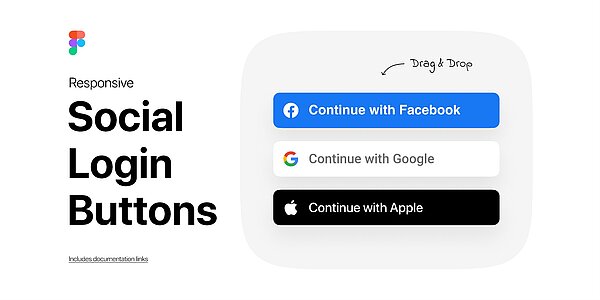
When any third-party social login is offered on iOS, Sign in with Apple has to appear with equal prominence.
The details that actually cause rejections
Beyond the button itself, Apple requires correct handling of the private relay email it offers users - rejecting relay addresses as invalid is a common and avoidable mistake - and capturing the user's name at first sign-in, since Apple only sends it once. Token revocation also needs graceful handling: users can revoke Sign in with Apple access from their device settings at any time, and your app should detect that and prompt re-authentication rather than error out.
Key actions
-
Add Sign in with Apple, using the official button, wherever any third-party social login exists on iOS.
-
Handle Apple's private relay email addresses as fully valid, and capture the user's name on first login.
-
Always keep email/password as a fallback alongside social login.
-
Revoke third-party tokens when a user deletes their account.
Non-Compliant UI and Navigation Guidelines
Apple's Human Interface Guidelines and Google's Material Design system define two genuinely different navigation philosophies, and the most common failure on cross-platform projects is transplanting one platform's patterns onto the other.
Back navigation is where most apps slip
On iOS, back navigation lives in the top-left corner of the navigation bar, and the swipe-from-left-edge gesture introduced in iOS 13 has become the expected default - blocking it without a clear alternative gets flagged. Modals get dismissed by swiping down or with an explicit Cancel/Done button, never a back arrow.
Android is more complex because back operates at the system level. Every screen needs to respond correctly to the system back gesture or button; ignoring it, or letting it close the app mid-flow instead of navigating up the stack, is a direct rejection trigger. WebViews embedded in the app need to intercept back and walk through web history before closing out, and the app's root screen should either exit cleanly or confirm before doing so.
Beyond navigation: general UI quality
Reviewers also check for the basics that separate a finished app from a work-in-progress: no placeholder text or "Coming Soon" screens, minimum tap targets of 44×44pt on iOS and 48×48dp on Android, loading states for async actions, and meaningful empty and error states instead of blank screens or raw error codes.
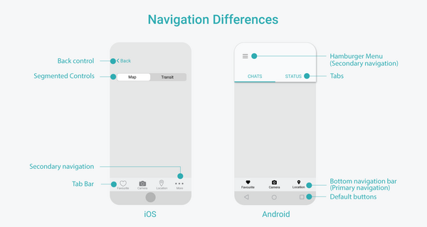
iOS and Android navigation conventions side by side - mixing these up is one of the most common UI rejections.
Key actions
-
Keep the iOS swipe-back gesture enabled and never override it without a visible alternative.
-
Handle Android's system back action correctly on every single screen, including WebViews.
-
Never use iOS-style back chevrons as primary navigation on Android, or vice versa.
-
Replace placeholder content, and add proper loading, empty, and error states throughout.
App Store Submission Checklist
Run through this consolidated checklist before every submission - new app or update. It pulls the highest-impact items from each section above; treat it as the final gate, not a substitute for the detail earlier in this guide.
Privacy & data
-
Privacy policy is native in-app, publicly accessible, and linked in both consoles.
-
Privacy Nutrition Labels and Data Safety declarations match actual app and SDK behavior.
-
All third-party SDKs audited for the data they collect.
Listing & metadata
-
Screenshots match the correct platform, current UI, and contain no inappropriate content.
-
Description, title, and category are accurate - no keyword stuffing or unverifiable claims.
Content & accounts
-
UGC apps have report, hide, block, and report-user features backed by a moderation process.
-
In-app account deletion is available (or correctly declared as not applicable) with tokens revoked.
-
Sign-up flow is fully native - no external redirects.
Review readiness
-
Demo credentials are unlocked, pre-populated, tested, and documented in App Review Notes.
-
The reviewer account is protected and monitored daily throughout the review window.
-
Hardware-dependent features have a mock mode or a complete video walkthrough attached.
Device & UI
-
Layout tested on the smallest and largest supported devices, including tablets.
-
System back navigation and gestures behave correctly on every screen.
Payments & login
-
Digital goods use IAP / Play Billing exclusively; physical goods use a third-party gateway.
-
Sign in with Apple is present and equally prominent wherever other social logins exist.
Final Thoughts
Every rejection is a learning opportunity, but it's far cheaper to learn from someone else's than your own. App review isn't adversarial - Apple and Google are protecting their users and the trust people place in both stores, and the more precisely you understand what reviewers check, the fewer surprises you'll run into at submission time.
Policies also move. A feature that cleared review six months ago can get flagged today, so treat the checklists above as a living pre-submission gate rather than a one-time reference, and keep Apple's Human Interface Guidelines, App Store Review Guidelines, and the Google Play Policy Center in regular rotation. And when something does need escalating - a stuck IAP product, an unexplained delay - remember that the account holder's direct communication carries more weight with Apple than a developer or agency account ever will.
Ready to Get Your App Approved on the First Try?
App store rejection reasons are almost always avoidable with the right process in place before you submit. PIT Solutions has taken apps through the app approval process across Android, iOS, and hybrid builds, and we build compliance - privacy, moderation, payments, accessibility - into the development process rather than bolting it on at the end.
If you're preparing a mobile app submission, dealing with a rejected build, or want a second set of eyes before you go live, Get in Touch with PIT Solutions - our team can review your submission, handle iOS and Android development end to end, and support you through launch and ongoing app store visibility.